UX Design
What does it feel like?

UX Design
What does it feel like?
UX Design is the art of considering whether each touchpoint of the user experience is intuitive and delightful. Often it is considered exclusive to the realm of product or screen design. However, it is absolutely crucial to the panoptic design process. For example how does the user feel when a certain color is used? Do visuals such as color and texture elicit the desired emotional response?
Because the core of UX design often involves new and future products, I am unable to show much of what I have worked on with clients such as Magic Leap, Microsoft, Intel, Eli Lilly, VMWare, Qualcomm, Alaska Airlines, and Oculus.
I spent nearly 18 months working with Magic Leap in the foundational stages of their new OS, LuminOS.
…that had to consider multiple input modalities, contexts, actions, and system requirements. I also led out in character, environment, and prop design as well as storyboards, color keys, and motion prototypes for VFX and interaction mechanics to define system-wide guidelines for many of the platform’s apps and core features.
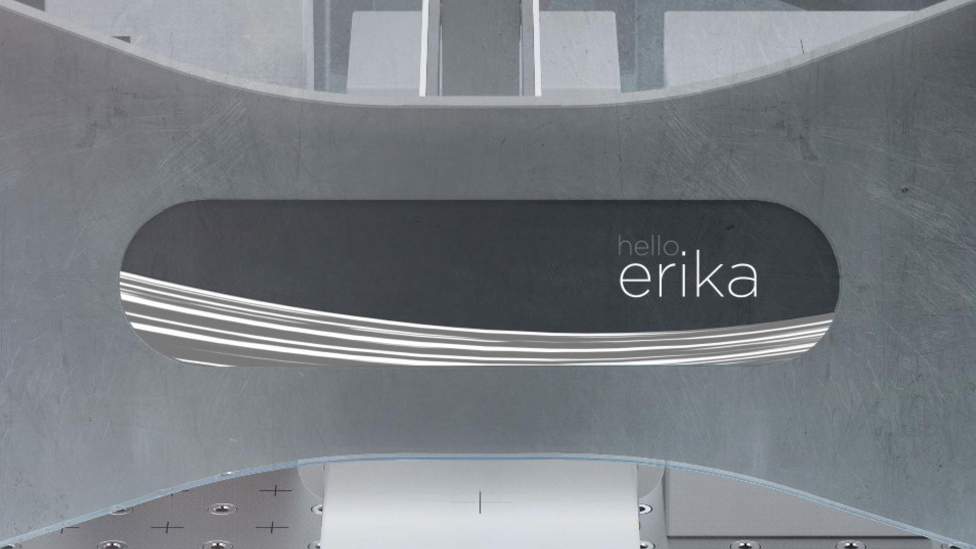
The first six months were spent simply exploring how this OS would live in the user’s physical world. This led to a set of recommendations to guide the rest of the system design. I worked on Helio, which, at the time, was to be the world’s first MR browser, as well as Avatar Chat, or Social. I also spent a significant amount of time designing the out-of-the-box-experience (OOBE), which, as of this writing, is still in development.

Magic Leap’s mixed reality (MR) web browser needed to break free of the flat screen and live entirely in 3D. At the time I began, there was nothing else like this anywhere, so this was starting from scratch. As I worked through this challenge I kept asking questions:
What does it mean to browse in 3D? What is meaningful about it? Are there reasons to do this beyond a “cool” factor?

A major limitation was the restricted field of view (FOV). Contrary to popular belief, the headset does not provide wall-to-wall coverage for total immersion. Instead it’s more like looking through a porthole. This limitation inspired ideas to pull 3D objects out of the web into the physical world. Users can set objects at any size and location to completely customize their space.
I also explored little magical pockets around a user’s space containing minimized browsing sessions. Quick and rough animation prototypes constructed in Maya.


The persistent world space presented the possibility of fully deconstructed websites and live experiences to be as spread out within the user’s space as desired. Each design needed to work within the “porthole” of the FOV.


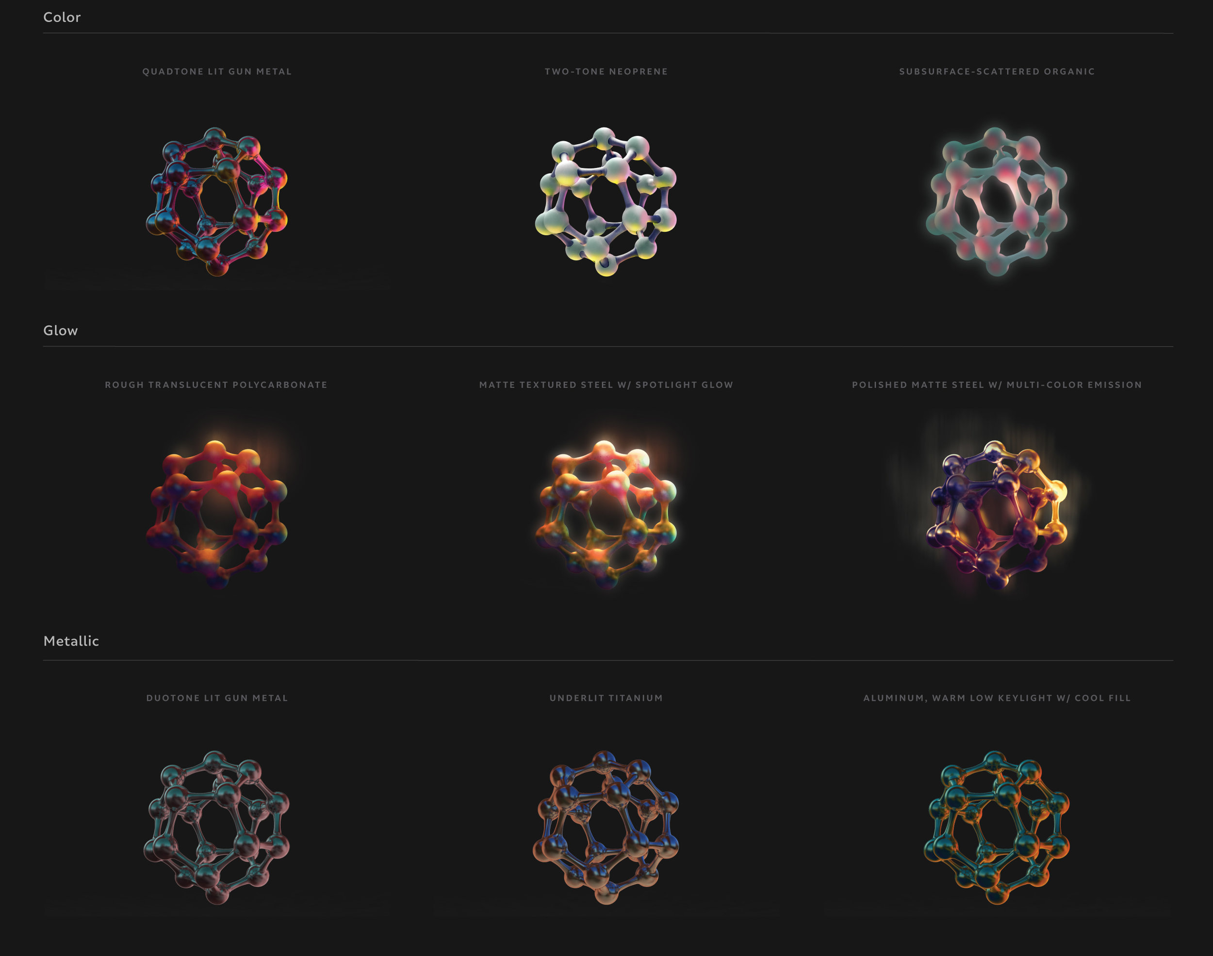
Much of the project required visual explorations that were closely tied with UX considerations. Quick rough paintings informed various motion studies and prototypes to explore this hidden world that only comes out to play in the Magic Leap One. Deep knowledge of the UX goals stemming from months of deep UX and interaction design work guided the visuals.
And because the UI literally lives in the real world, it only made sense to explore unique material, light, and color combinations (3D models and form design by Kenneth Tay).
Magic Leap’s Social app had lofty expectations of bringing people together in ways that were as near to physical reality as possible without external cameras and sensors. Note: this main banner is the final avatar chat marketing image - I did not create it.

The lack of external cameras and sensors created a huge challenge in terms of accurate representation of the user in 3D space. Cameras can only see the eyes in the device. They don’t see the remaining facial or body movements. The controller informs the system of the general position of the single hand, but it has no idea what the other arm or legs are doing. One of the core design principles was remaining true to the medium and not misrepresenting the user’s intent. This led to explore faceless and bodiless concepts that emphasized only what the system could detect without feeling creepy.
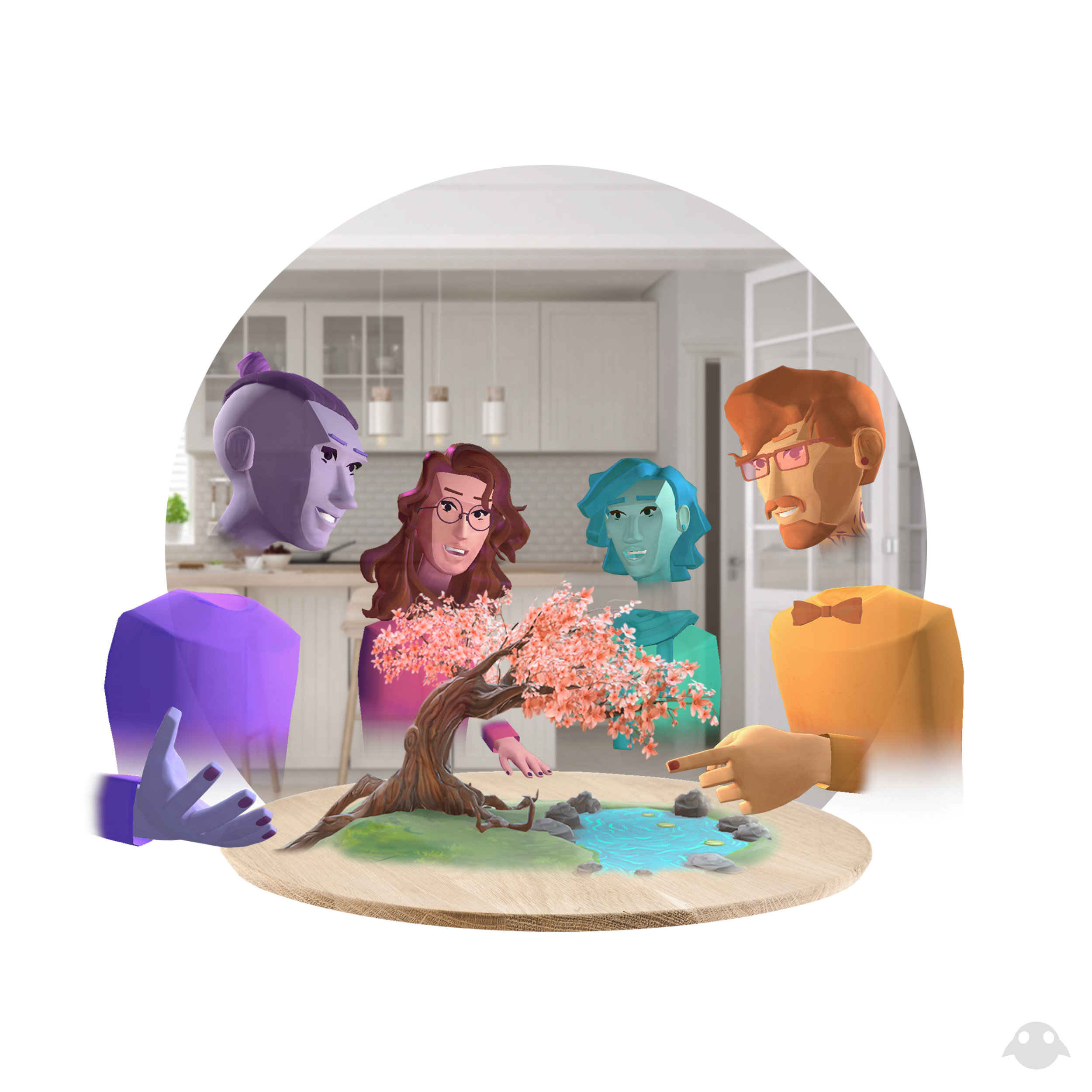
This is the current iteration of the avatars in the system. Note the single hand and faded lower body. Also note: this is a Magic Leap marketing image - I did not create it.
Thousands of students from African countries pursue their education each year through the support of The MasterCard Foundation Scholars Program. Becoming a MasterCard Foundation Scholar can be a life-changing moment that opens up opportunities to study at top universities in Africa and around the world.
This community would be based on a new social learning platform that elevates scholarship into a source of lifelong learning and empowers the next generation of African leaders to create social change.
Because this community was so large and diverse, we wanted to ensure the system was scalable across both desktop and mobile, with each element always accessible. We felt the onboarding process for new scholars would be critical to enabling integration. If we could get them to properly signal what they were interested in and tie that into the network, much of the rest of the experience would be set up for success. We began sketching big picture flows and interaction models before considering the details of the visual design.

Before Baobab, Scholars had no way to easily connect with fellow Scholars involved in The MasterCard Foundation across campuses and programs. Baobab acts as a digital rolodex, giving Scholars instant access to a community of students like them who share their experiences and can serve as a built-in support system as they adjust to life in a new location.
We designed space within Baobab for Scholars to meet career mentors and find job opportunities to accelerate their success once Scholars return home. Specially invited African business and community leaders participate in Baobab as mentors and chat directly with Scholars, answer their questions and provide valuable professional advice.
Scholars use the platform daily to connect with others, tackle shared challenges and find inspiration and guidance from mentors. For more information, please visit
Enterprise resource planning (ERP) solutions are costly and time consuming to design, create and implement. The existing process is manual, consisting of many consultants conducting many in-person discussions followed by custom design and coding, equalling lots of time and money and limited ability to change the software once deployed without incurring high additional costs.
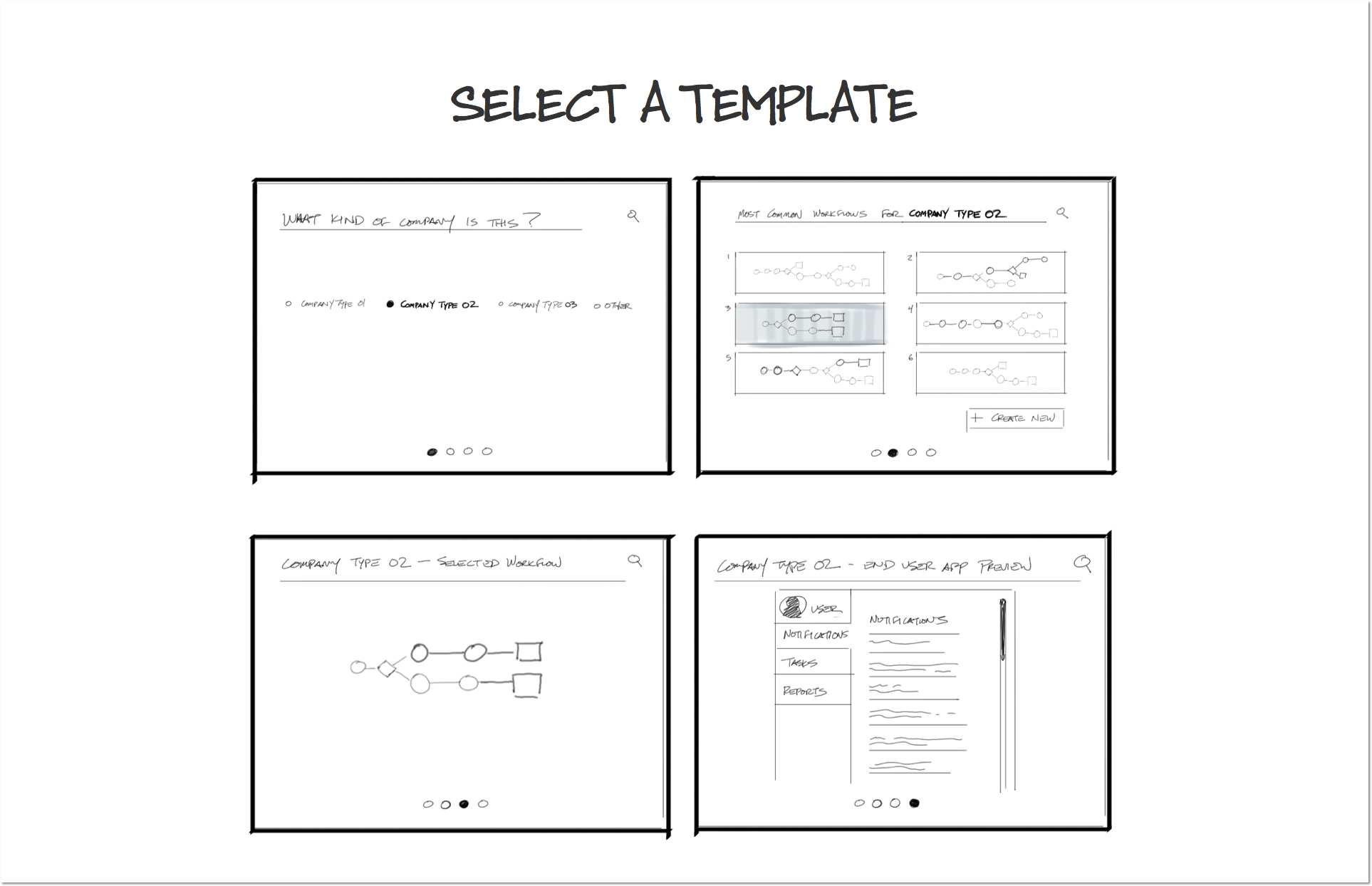
The amount of variables a system like this has to consider made this an extremely complex problem—one of the most complex in Artefact's history, in fact. We drew on Kagami's deep understanding of their target companies in areas of the world, such as concrete manufacturers in Africa, to learn how the custom applications would be used. We developed seven personas to address the complexity of people and roles involved in the process. We then created a set of scenarios that identified all of the key activities that each persona would need to generate the ERP applications. This helped us develop six overarching design principles to guide our design.
These ideas addressed both what capabilities the application should have, and the unique ways the tasks might be realized in the interface.
Our system had two main components:

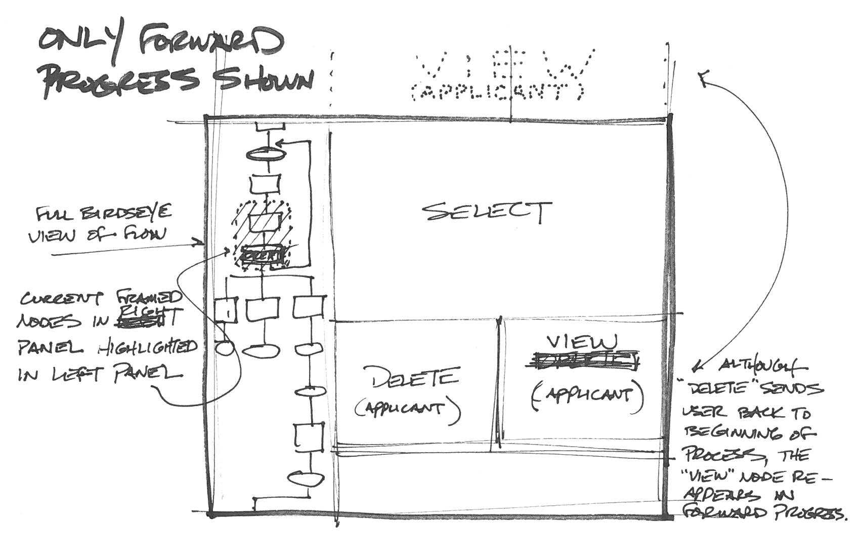
Templates are the starting point for projects that are manually created by industry experts and are intended to be reused by multiple projects in an industry. Templates look like logic diagrams and take a visual, contextual approach to programming. That is, only certain functions and options are available at contextually-appropriate places, helping the expert craft project flows quickly and accurately.
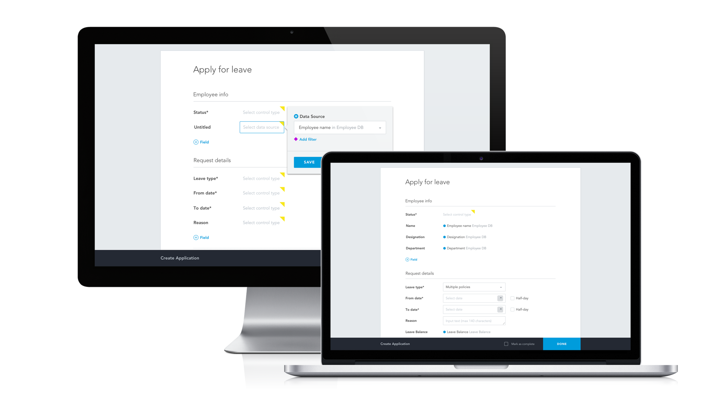
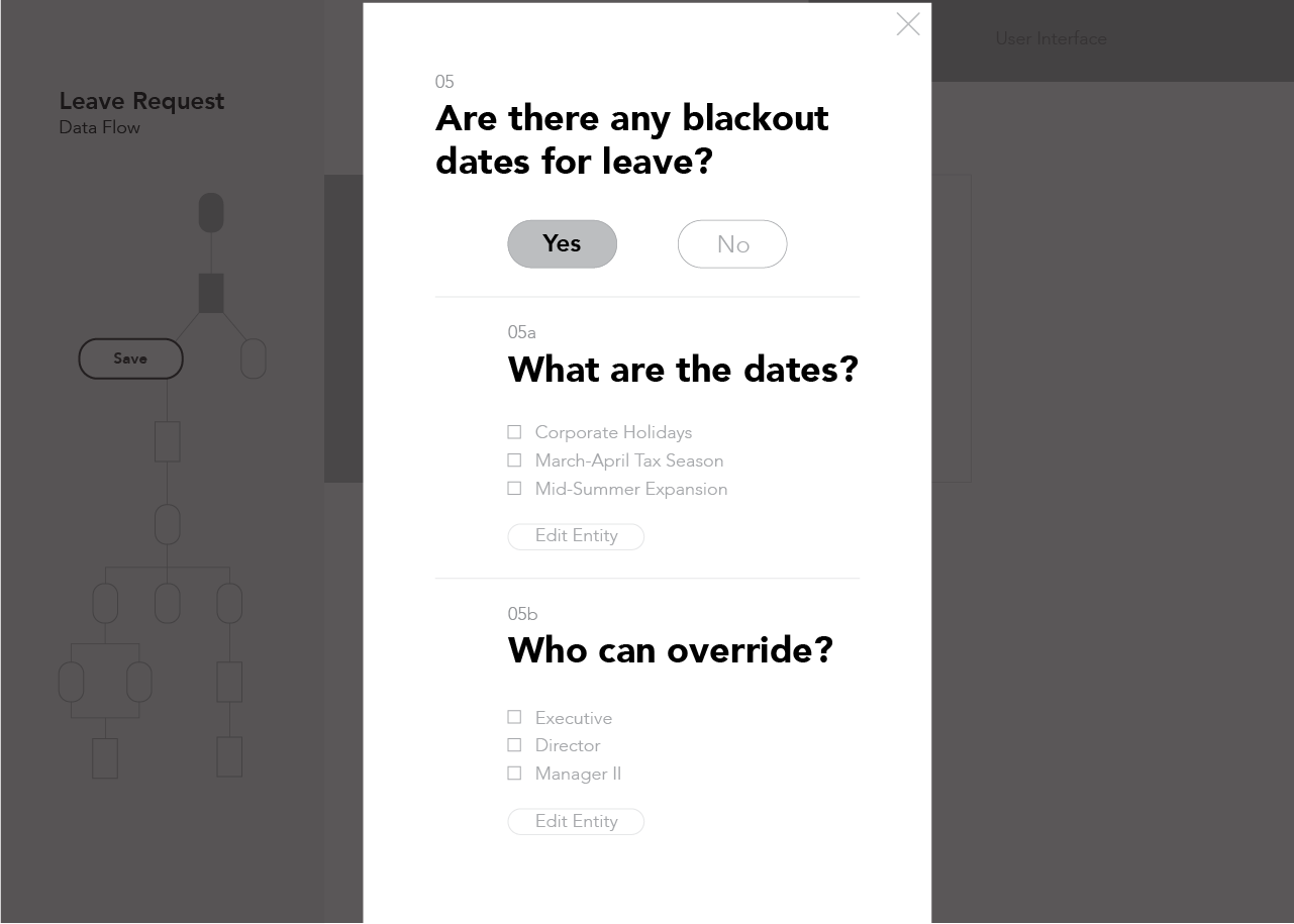
Forms are the final product and output of the system. They are basically HR forms, with each field having only the options specified by the template. The customization of these forms allows the organization to employ less technical people instead of high-cost ERP experts to reduce overhead costs.
We designed a series of portals for Kagami experts to access their various libraries of Projects and Templates while separating out the most relevant things at any given moment.
We also designed a dashboard view capable of generating extremely detailed custom reports.
As of this writing, the product is still in development.
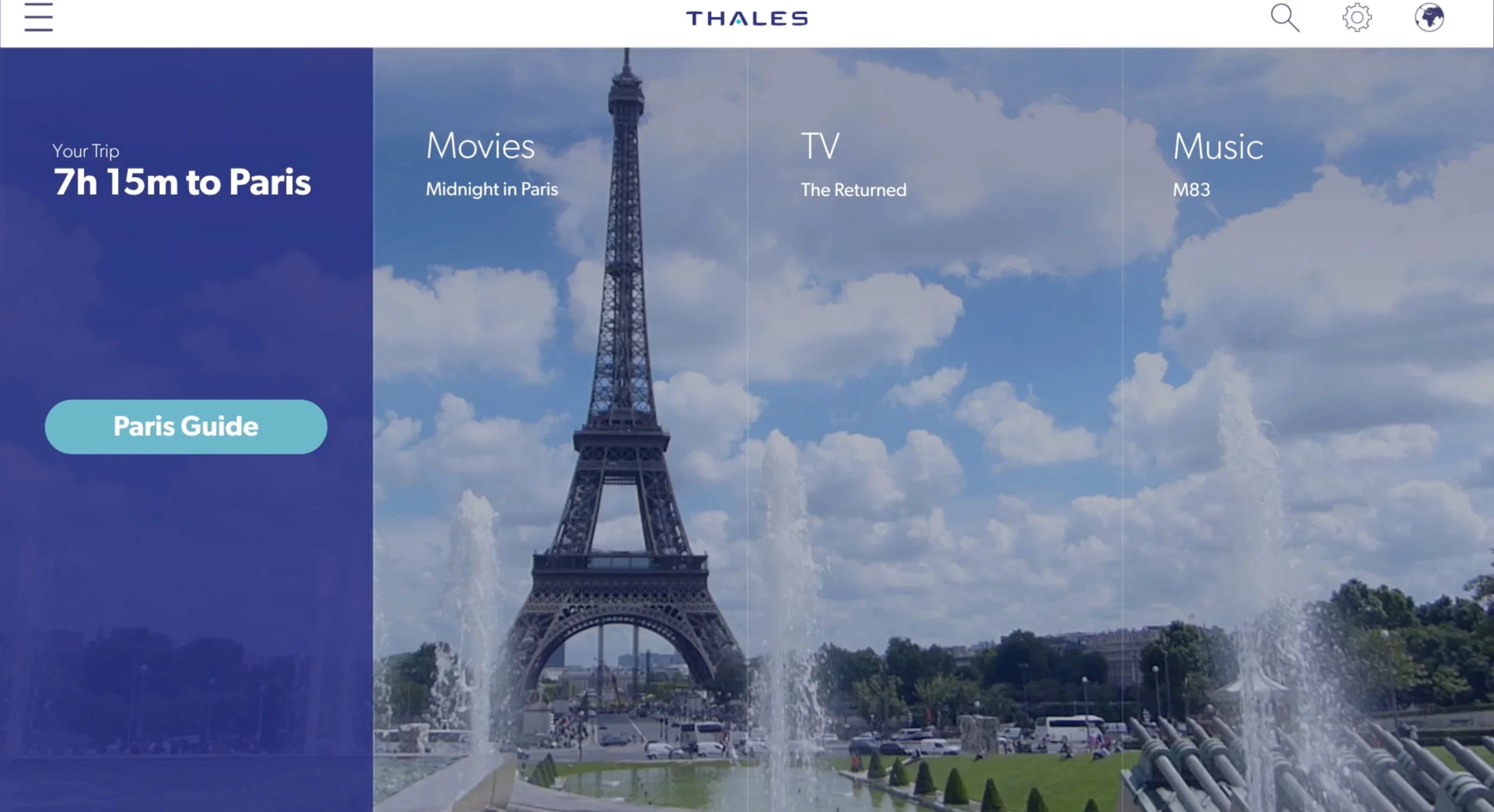
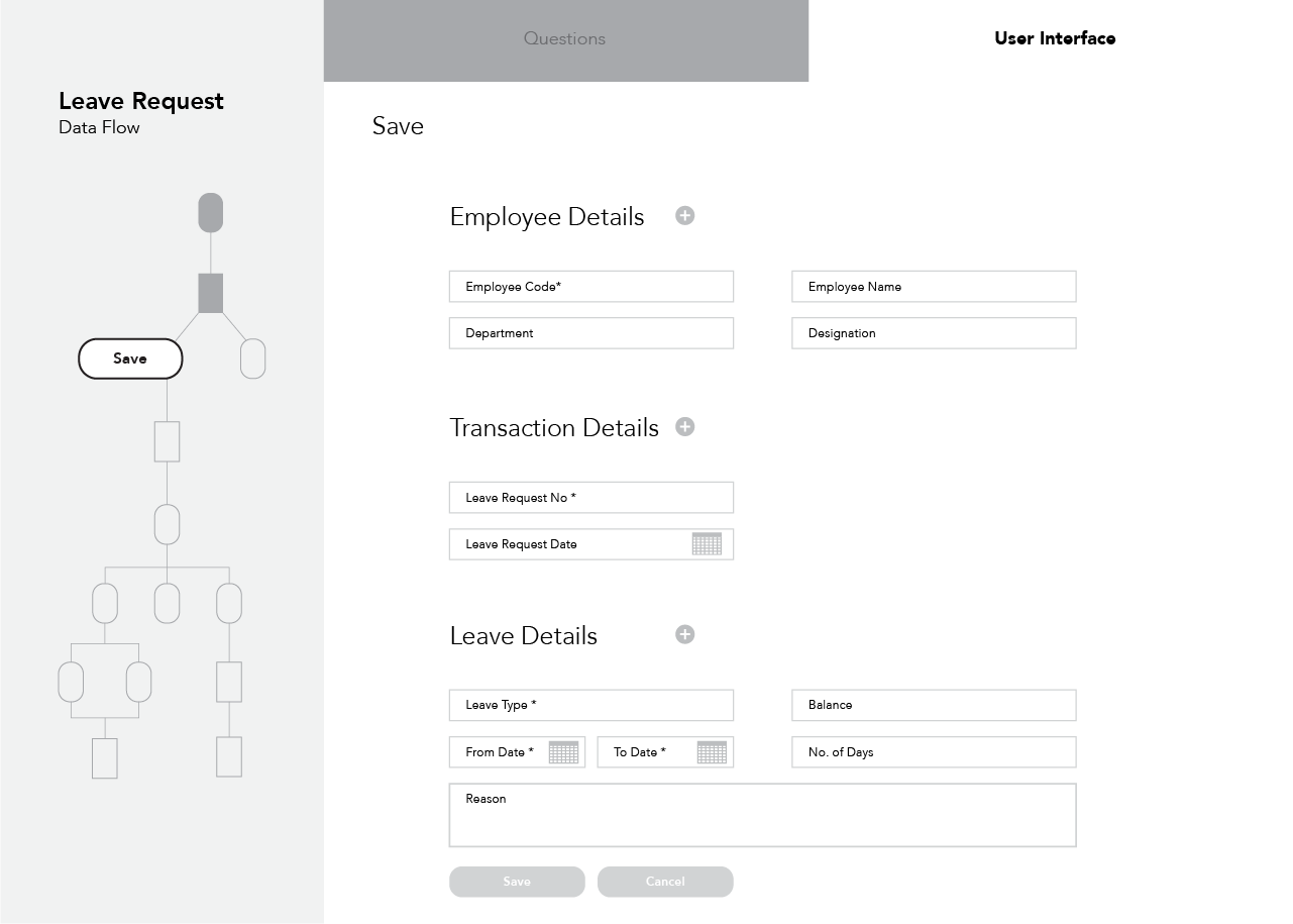
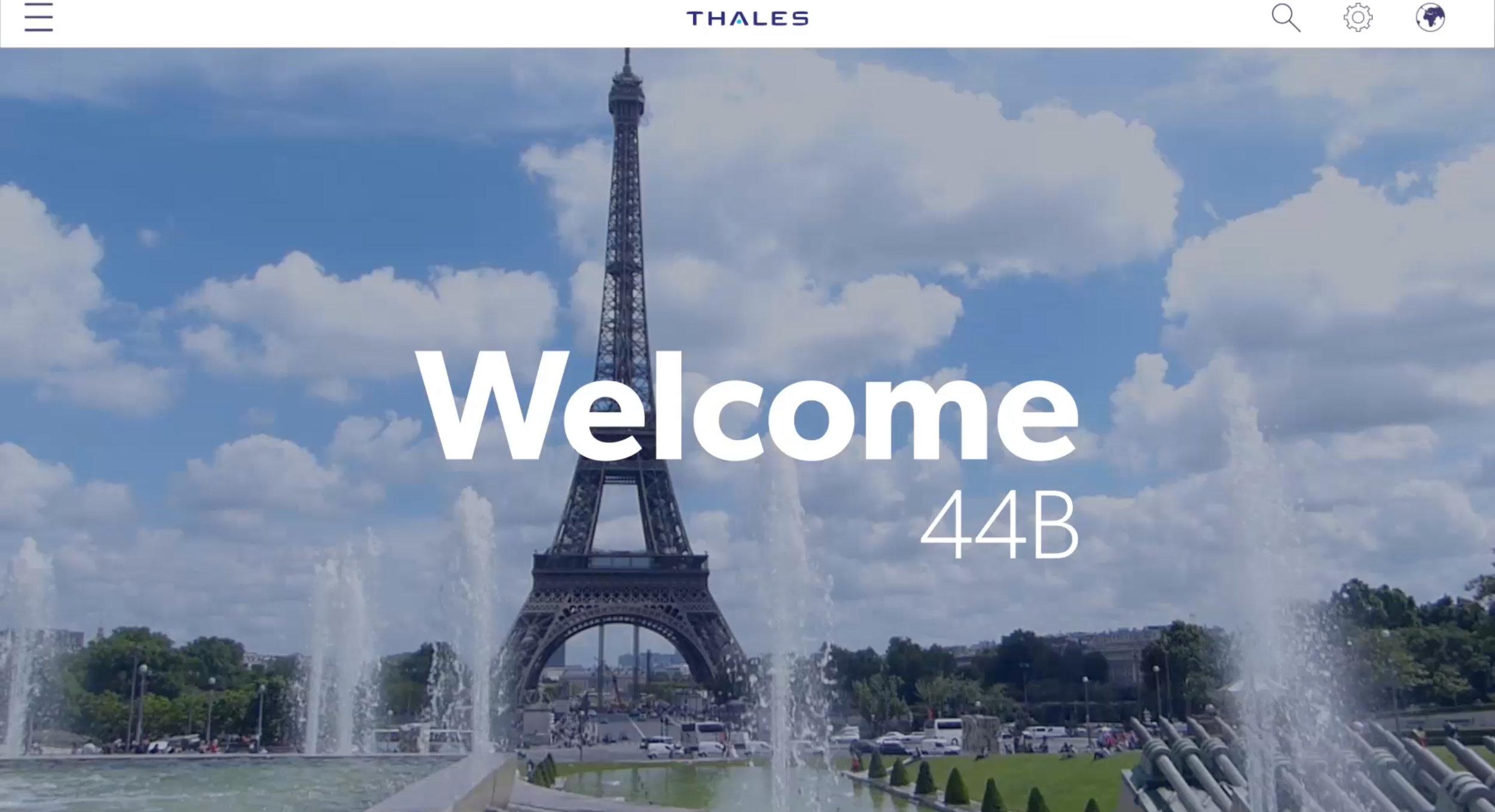
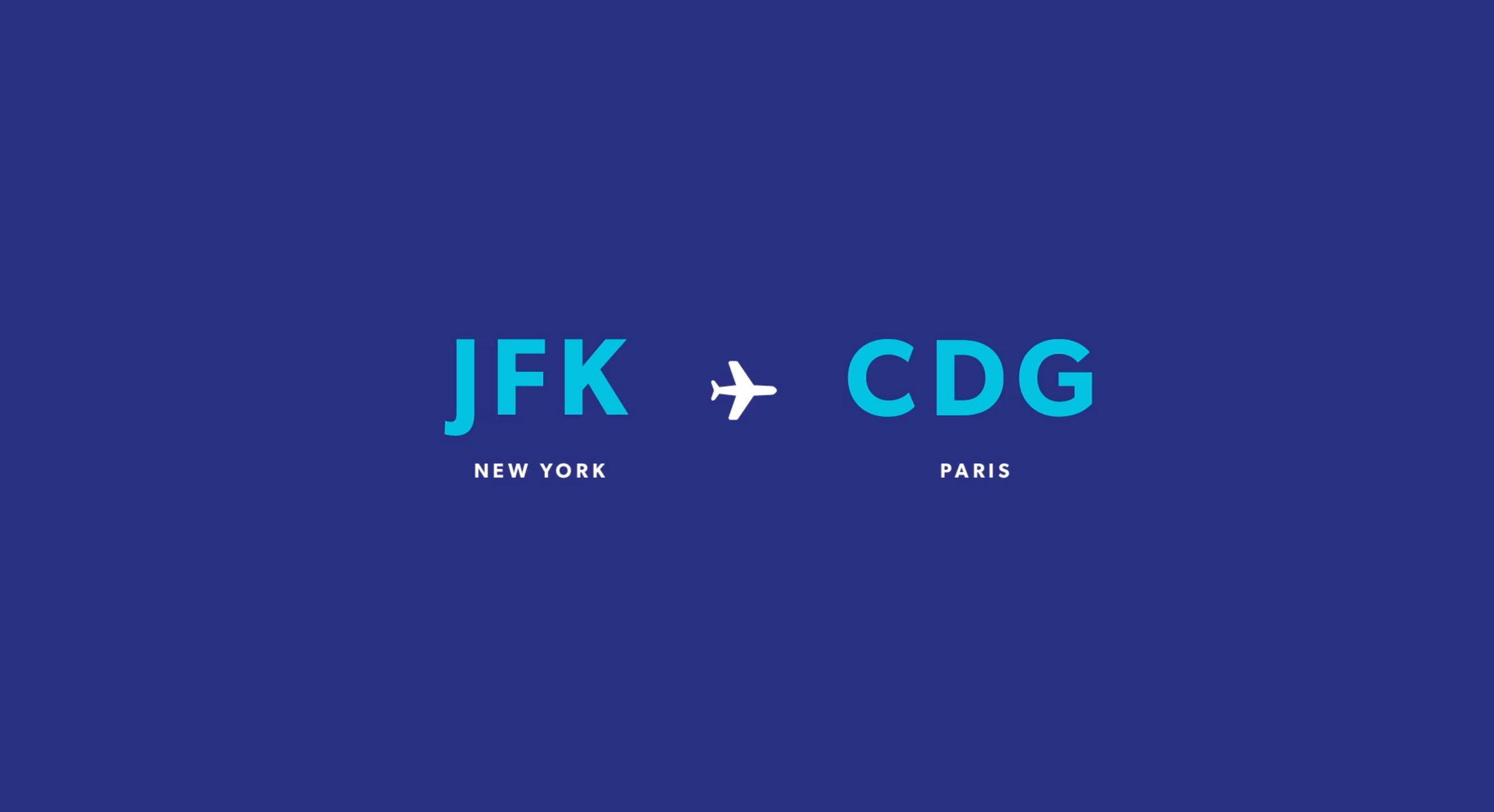
Thales, one of the leading in-flight entertainment companies in the world, approached us at Artefact to take the in-flight experience (IFE) to the next level. Building on the work we had already done for them in this space in 2015,
We began by sketching out IFE UX flows that contained almost exclusively destination-based content and worked through ways that could logically and comfortably enhance the flight experience.
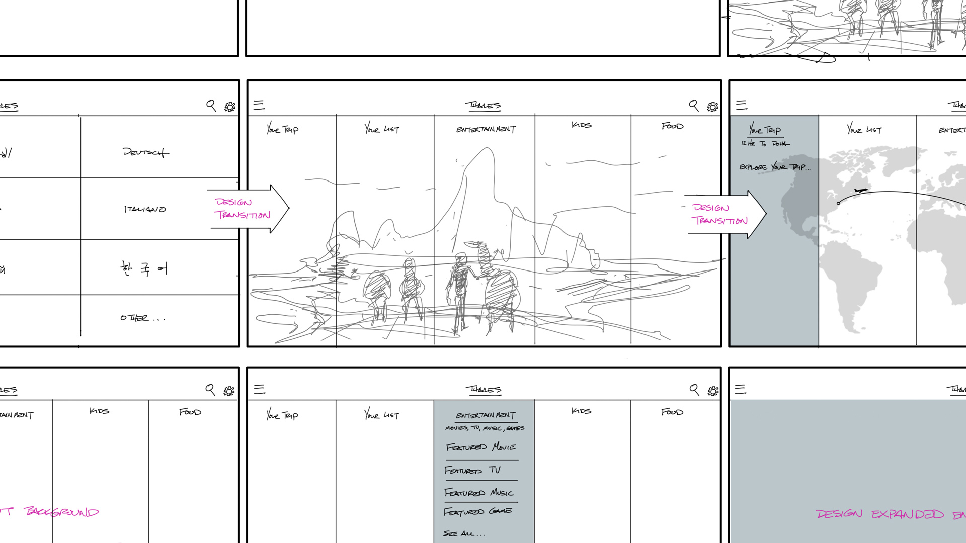
The flight to Paris, for example, featured films set in France with French artists, musicians, and travel guides peppered throughout. We took our designs to a higher visual fidelity and cut it together into a two-minute video that fleshed out the animations and transitions for a full IFE experience.
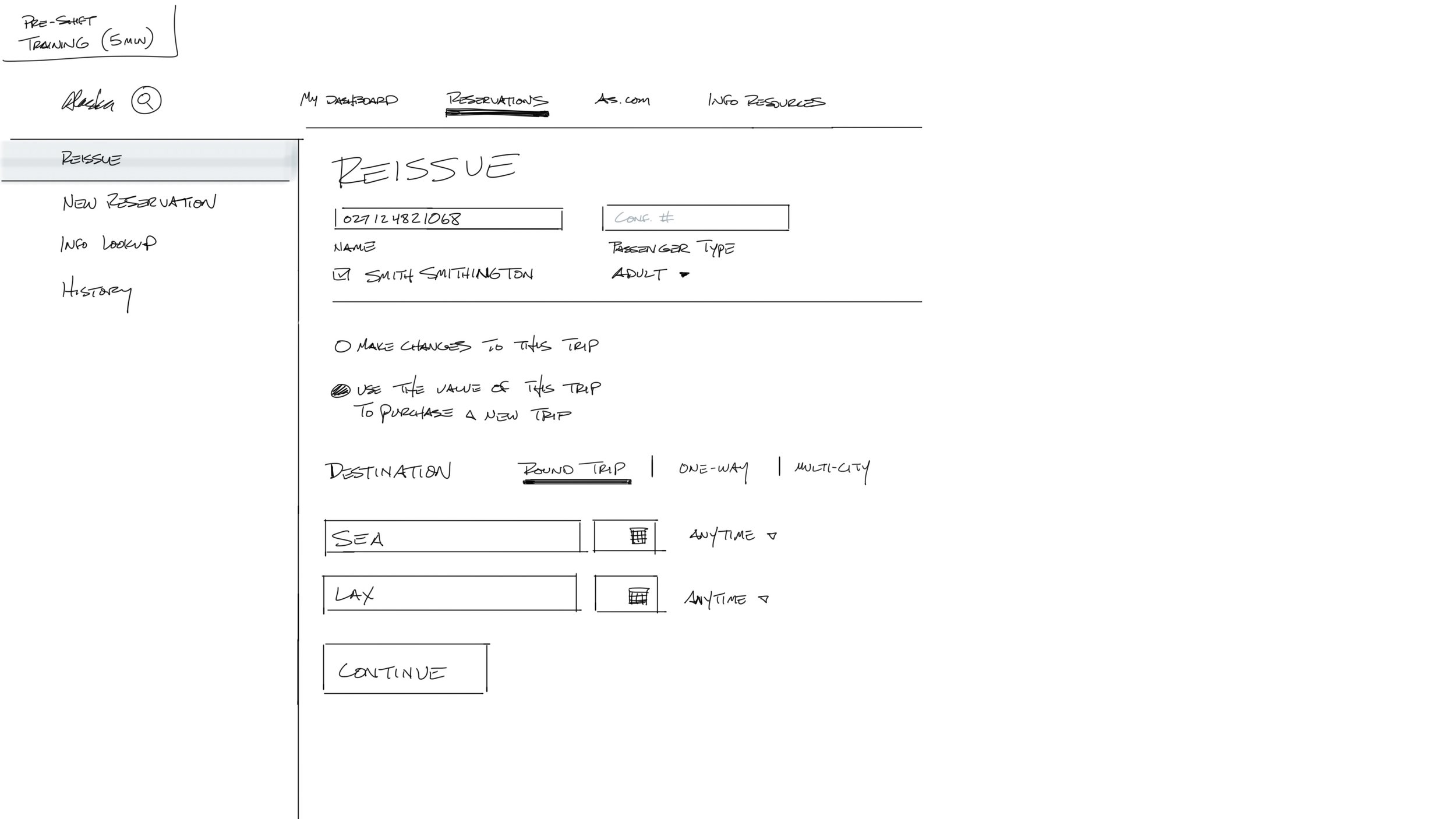
Alaska Airlines approached us at Artefact to help them improve the workflow and software user experience for their call center representatives.
After a couple of weeks of hands-on research at their call center, we synthesized our findings, gleaned insights, and developed design principles which informed every aspect of the design. We then began to sketch new workflow and software concepts.
We brought our concepts to a higher fidelity and created rough concept prototypes in Invision. We went back to the call center to evaluate them in-person with call center representatives, and
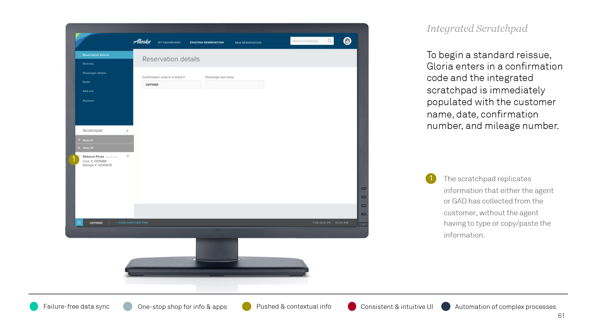
failure-free synchronized data
consolidated one-stop shop for info and apps
pushed and contextual information
consistent and intuitive UI
automation of complex processes.
We also provided a high-level roadmap for future rollout. The UX concept screens flowed through a future scenario as though Alaska had executed the full roadmap.
The scenario followed Gloria, an agent, through a call with a customer named Rebecca who called in with two issues on an existing reservation:
Her sister’s name is incorrect on the reservation
She needs to change an existing flight segment
The UX concept screens illustrated specific examples of solutions within each key opportunity area.
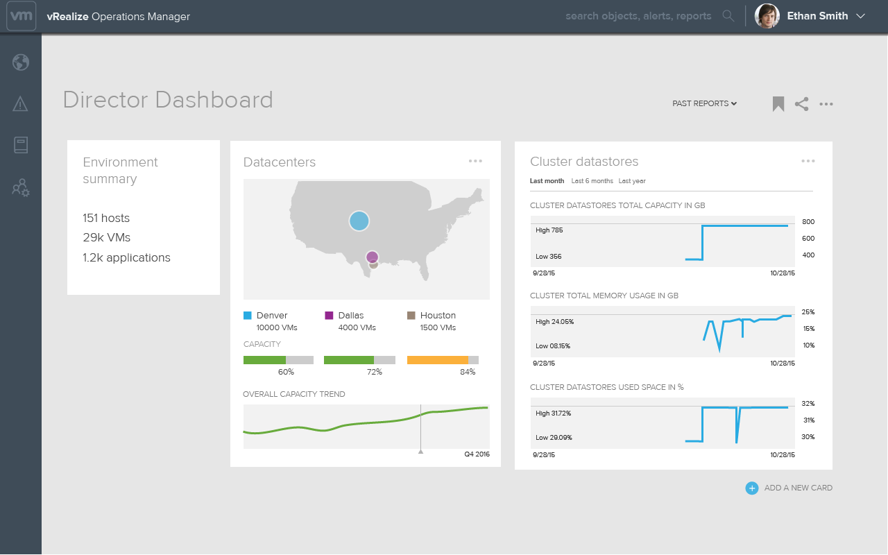
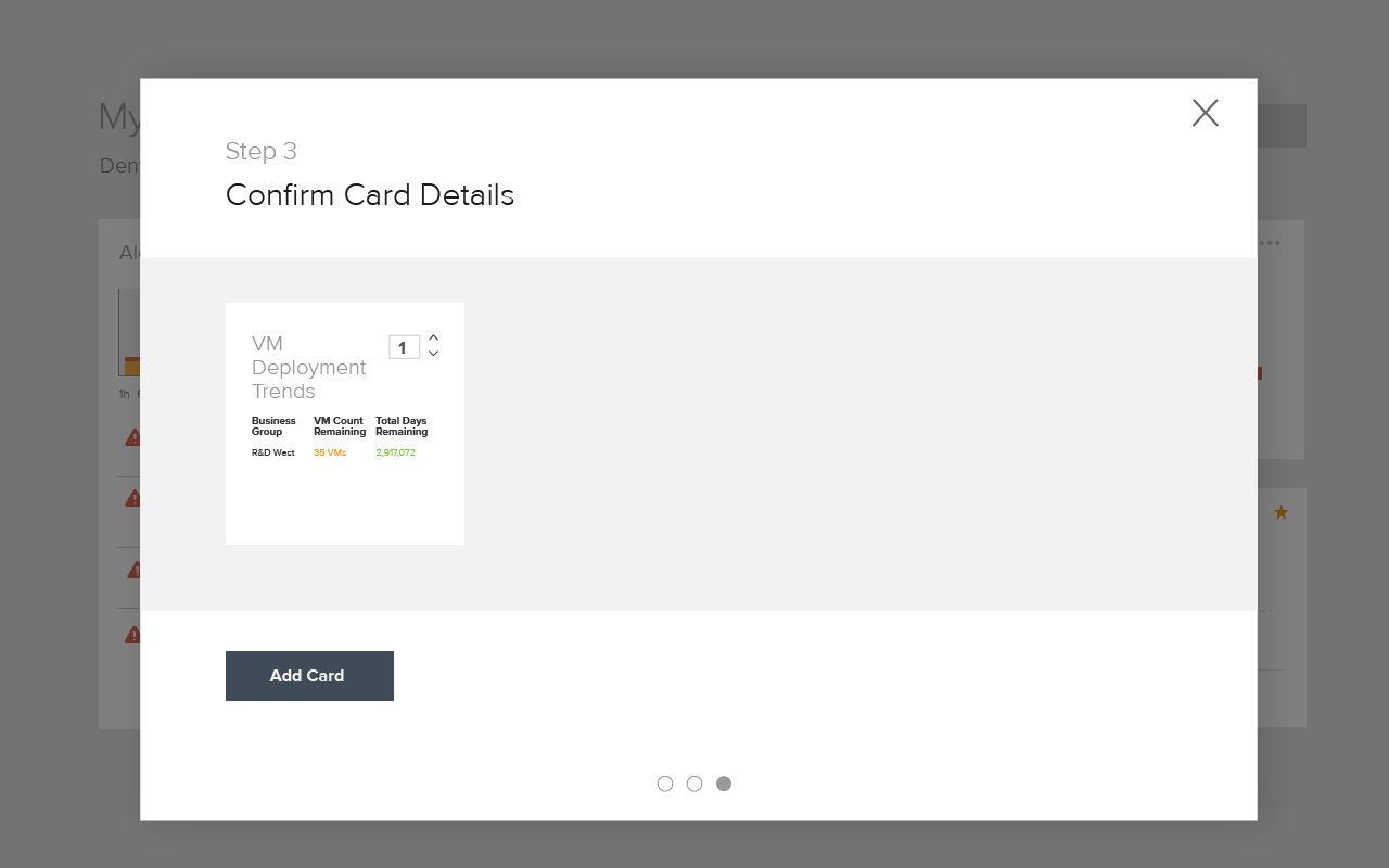
VMWare asked us at Artefact to establish a new vision for vRealize Operations (Ops.Next) based on research-driven insights.
After extensive user research across several states and companies, we noted plenty of challenges the users faced day-to-day. We saw opportunities to transform vROps from a “views and reports” tool to a portal that would empower teams with shared understanding and help IT business decision makes become proactive and confident about the health and capacity of their systems.
We designed a customizable dashboard that would serve as the launching pad for the rest of the app in order to optimize for common workflows and reflect best practices. We enabled it with pin-able information cards and intelligent search to cut through the noise and provide clarity of purpose. We also designed a system of application-centric troubleshooting to provide for a varied set of users with a focused set of needs.
We created click-through prototypes to paint a future vision where Ops.Next became a critical tool for more stakeholders within the organization.
This would free the “PhD” level masters of the tool from heavy use, allowing them to delegate more tasks to their team to focus on planning and strategy. Our vision would also enable customers to self-diagnose their applications and solve problems with fewer escalations.
Artefact submitted two projects to the Design Management Institute (DMI) to be considered for Design Value Awards (of which, Vicis ZERO1 won second place). I was asked to design the print posters for the application.
Once upon a time Artefact was going to produce a series of thought leadership talks called "Artefact Talks." I was tapped to design the animated bumper package for the series.
I designed a series of visual storyboards to guide the discussion. I also created several animation concepts showing transitions and motion to suggest how these might come to life.

Project Team: Danny Stillion, Will Carey, Ricardo Figueiroa, Francois Rybarczyk, Dav Rauch, Quinton Larson, Claudio Fresneda, and myself
How will tomorrow be different from today? We’ll live longer and move faster. Our resources will dwindle while our technological capacity grows. But our basic needs to sleep, eat, work, and get from place to place will stay the same. That last part is what we were interested in. How will we move people, things, and spaces together in the next decade?
(Exterior SUV design by Ricardo Figueiroa). For the full rundown, visit automobility.ideo.com.
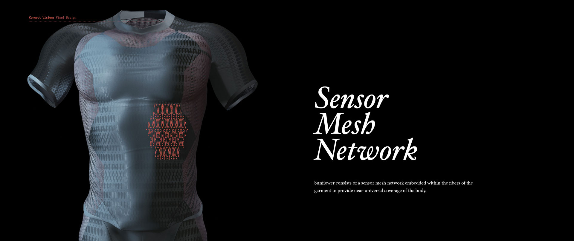
For my master's thesis at the University of Washington (M.Des, 2015), I designed a bodysuit-based navigational system for low-vision environments called "Sunflower," named after the flower that always orients toward the sun.
People in low-vision environments often meet challenges that cannot be solved by handheld mobile devices. Firefighters work in extremely low visibility while carrying heavy loads. Parents fear a small child wandering off in a crowded public area, lost in a sea of bodies. Students on complicated campuses often bike outdoors, only to proceed indoors where GPS is no longer viable. In these situations where eyes- and hands-free are not optional, how might we use other senses to find what we are looking for?
I created a Firefighter journey map to understand the navigational pain points and sketched out a ton of ideas that could help alleviate them.
Eventually this work led to the concept of a full-body wearable consisting of a network of tiny nodes that contain sensors, actuators, IMUs, and CPUs to orient a user to the environment. Similar to pixels in a screen, the nodes fire together in swarm patterns to generate haptic feedback from the surrounding environment. Although the uses for a device like this are countless, this project focused on design to impact personal navigation, particularly in low-vision environments.
Sunflower provides both an eyes- and hands-free solution by locking on to a destination within a scanned 3D floor plan of a building and leading the user by touch.
It also provides a secondary pulse for decision point assistance to guide left, right, up, or down. As the user approaches the destination, the pulse intensifies like a game of “Hot and Cold” until he or she arrives. Through this combination of pulses, the user essentially feels 3D space.
A few years ago I designed the corporate identity system for my design firm, The Sulky Bros. Manufactorium that I formed with my best childhood friend, Brandon Brown. Our own narrative of a couple of designers who shared the same hopes and dreams since middle school informed everything from the main brandmark, Robbinius J. Robb (which may or may not have been named after something like this) to the short story script and world design that informed everything else.
Robbinius, or Robbi for short, emerged from an infatuation with flight and discovery in a simpler time, and symbolized this childhood friendship forged in a time of less care and responsibility. The mark was designed to symbolize the challenges and efforts of two designers who wanted nothing more than to break the gravity that bound them to this earth to see the world from an uncommon vantage point.
I extrapolated the phrase "a simpler time" to a Victorian, fleur-and-bent-metal visual theme that inspired our main logo typeface as well as decorative elements and layouts.
The result was a clear, yet personality-driven and rich identity that conveyed the energy and creativity of the Bros., and lent itself well to any design space across screen or print.


