Ubiquiti | UNMS
Desktop App UX + Visual Design
Ubiquiti | UNMS
Desktop App UX + Visual Design
Project Leadership
Art Direction
UX Design
Scenario Design
In order to tackle this monster project, I divided the app into four main opportunity areas. If these four areas were solved, network and client management would be greatly simplified.
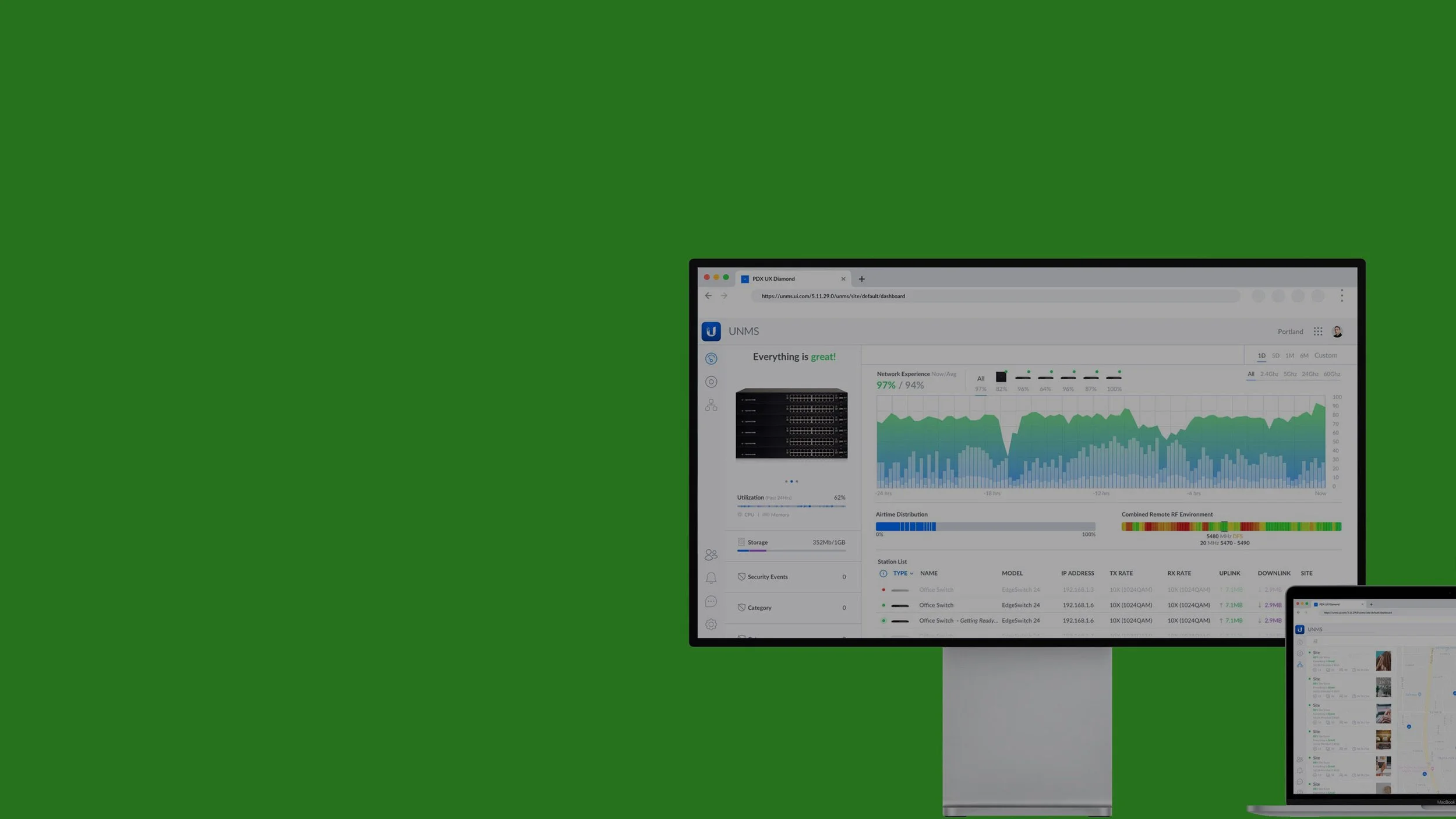
In order to make the dashboard more usable, data viz was redesigned with multiple actionable data points within each chart. System aggregates and stats were redesigned for greater readability.
Collapsed or consolidated UI devices (“Elements”) to free up room to add more columns and rows per screen. Also increased the cleanliness and readability of the rows, such as: actions revealed on hover, status badges shrunk to colored dots, and filters collapsed to single icon.
Moved the map to be the central focus and broke each customer site out as an individual node that can be drilled down to view full topologies and network status.
Reduced the amount of color to draw focus to the actual controls; added whitespace to each control for consistent vertical spacing between controls to increase usability.
In order to make the dashboard more usable, data viz was redesigned with multiple actionable data points within each chart. System aggregates and stats were redesigned for greater readability.
Overall network experience is layered with usage and throughput data, while maintaining a concise footprint.

Network health is surfaced in a declarative sentence to simpliy frequent checks.
Visual representations of radio spectrum, interference and channel usage are broken out and surfaced at the top level of the Dashboard.
Collapsed or consolidated UI elements to free up room to add more columns and rows per screen. Also increased the cleanliness and readability of the rows, such as: actions revealed on hover, status badges shrunk to colored dots, and filters collapsed to single icon.
Property panels became the workhorse of the new UNMS that incorporated the standalone apps for each product into a single app for greater coherence. UI controls are now evenly spaced for maxium usability.
Moved the map to be the central focus and broke each customer site out as an individual node that can be drilled down to view full topologies and network status.
Reduced the amount of color to draw focus to the actual controls; added whitespace to each control for consistent vertical spacing between controls to increase usability.
UNMS (currently in development) now consolidates all of the individual hardware applications into a single app with standard UX design patterns. Affordances and feedback are more clear and it is more visually consistent and on-brand for Ubiquiti.